Best Python Chart Examples
The Python Graph Gallery has always been a reservoir of inspiration, providing hundreds of foundational chart examples for newcomers and seasoned developers alike.
While our vast collection offers a stepping stone into the world of data visualization, the following list stands out.
Every chart here represents the pinnacle of craftsmanship, exhibiting the depths to which matplotlib can be customized. These are not just graphs; they are polished masterpieces, ready for publication.
While I'm deeply indebted to the original authors for their stellar work, it's worth noting that many of these visualizations were first conceived in R, a testament to its rich visualization ecosystem. In an endeavor to bring the best to our Python community, I've translated these gems to further showcase the versatility and power of matplotlib.
Dive in and get inspired! 😍
Love Python and Dataviz? I send my best tips once a week in my "Dataviz Universe" newsletter. More than 8000 people love it!


Salary evolution
Minimalist black and white line chart about the salary evolution of a freelance data scientist
by Joseph Barbier
Read tutorial

Beyond the choropleth: a polygon map
Number of shops within a 20-minute round-trip walk
by Sebastiaan Broekema
Read tutorial


Unemployment rate in Belgium
Breakdown and distribution of the unemployment rate in Belgium
by Koen Van den Eeckhout
Read tutorial

Animal adoption evolution
Waffle chart about animal adoption evolution between 2017 and 2024.
by Joseph Barbier
Read tutorial

Unemployment rates in the US
Combine two choropleth maps with different granularities
by Joseph Barbier
Read tutorial


Evolution of temperature variation
Temperature change compared to the average between 1951 and 1980.
by Joseph Barbier
Read tutorialShare of cereals used as animal feeds
Change in the number of storms by storm type between 2010 and 2022.
by Muhammad Azhar
Read tutorial

Share of cereals used as animal feeds
Breakdown by continent of the percentage of cereals used for animal feed.
by Benjamin Nowak
Read tutorial

Japan's population evolution
Evolution of Japan's population between 1952 and 2024.
by Joseph Barbier
Read tutorial

Earthquakes around the world
Repartition of earthquakes around the world, with description of extensive description and annotations.
by Joseph Barbier
Read tutorial

Density population in Asia
Cartogram (non-contiguous) of population density in Asia.
by Joseph Barbier
Read tutorial

CO2 consumption in Europe
Choropleth map of CO2 consumption per capita in Europe, with a custom legend.
by Joseph Barbier
Read tutorial

London recycling rates
Repartition of London recycling rates by boroughs, with small multiples of waffle charts.
by Lisa Hornung
Read tutorial

Evolution of natural disasters
Number of natural disasters over time per disaster type, with inflexion arrows for the legend.
by Joseph Barbier
Read tutorial

Unemployment rate during COVID-19
Evolution of unemployment rates between different regions across the world during the COVID-19 pandemic.
by Joseph Barbier
Read tutorial

Lollipop about music genres
A lollipop plot with a background image to visualize the popularity of music genres over time.
by Joseph Barbier
Read tutorial

Map with scatter plot on top
Path and duration of solar eclipses in the USA, in 2023 and 2024.
by Joseph Barbier
Read tutorial

Multiple choropleth map
Combine multiple maps about happiness together, with a lollipop plot for the legend.
by Joseph Barbier
Read tutorial

Scatter plot with specific highlights
Relationship between footprint and biocapacity of countries, with specific highlights on some countries.
by Joseph Barbier
Read tutorial

Dumbell chart
Advanced dumbell chart about wins and losses in the Bundesliga.
by Cédric Scherer
Read tutorial

Double heatmap for comparison
A double heatmap to compare normalized and non-normalized data about energy consumption in France
by Joseph Barbier
Read tutorial

Ridgeline with quantiles display
A ridgeline plot with quantiles and annotations to visualize the price distribution of rents in San Francisco.
by Ansgar Wolsing
Read tutorial

Polished table with bubbles
Investigating the 10 best and worst countries to live in, with bubble in cells to represent the data. A good way to showcase the plottable library.
by Fortune Uwha
Read tutorial

Line chart with word cloud
Movie titles in the background of a line chart to visualize average ratings over time.
by Joseph Barbier
Read tutorial

Mini stacked areas for US states
This compendium of stacked area charts went viral. Read a translation in python of this work by Enrin, originally written in R.
by Erin
Read tutorial

Choropleth map with gradient color
A choropleth map with a gradient color scale to visualize the number of people with cancer in European countries.
by Joseph Barbier
Read tutorial

Ordered & Mirrored barplot
A highly customized circular barplot visualizing Star Wars data using Python and Matplotlib. It provides a step-by-step guide from a basic barplot to a fully customized version including fonts, y-axis scaling, annotations and legend.
by Lisa Hornung
Read tutorial

Ordered & Mirrored barplot
A mirror barplot with individual observations using the Matplotlib library to visualize data about the Erasmus Program in European countries.
by Benjamin Nowak
Read tutorial

Scatterplot with grouping, highlighting and annotation
A scatter plot with custom annotations and colors, with some markers being circled.
by Data Wrapper
Read tutorial

Histogram with clean color scale and annotation
A clean and insightful histogram produced by the french institute of statistics showing the salary distribution in the country.
by INSEE
Read tutorial

Area over flexible baseline chart
An area over a flexible baseline to show deviations from a reference or baseline made with Python and Matplotlib or Plotly.
by J. Kühn
Read tutorial

Circular Barplot
A circular barchart with several features per group made with Python and Matplotlib
by T. Stadler
Read tutorial

Circular Lollipop Plot
A circular lollipop plot with customized layout, great color palette and in circle legend
by C. Scherer
Read tutorial

Violin and Boxplot combination
Allows the comparison of several groups with statistical test results on top
by T. Wang
Read tutorial

Circle Heatmap
A heatmap where each cell is filled by a circle with varying size
by M. Siple
Read tutorial


Line chart with faceting
Several highlighted lineplots arranged in a multi panel layout to explore the evolution of the water source installation rankings by country
by A. Madjid
Read tutorial

Scatterplot with images
A scatter plot with images inside each marker to provide additional context
by Tanya Shapiro
Read tutorial

Horizontal Barplot
A reproduction of an horizontal barplot made by The Economist to showcase the power of Python for dataviz
by The Economist
Read tutorial

Parallel chart
A parallel coordinate chart to explore the maximum ages recorded for different species of lemurs with Python and Matplotlib.
by G. Karamanis
Read tutorial

Inline labels
Good looking line chart with inline labels at the end of each line
by C. Scherer
Read tutorial

Line chart from the Economist
Mimicking the style of the Economist to get a clean line chart
by The Economist
Read tutorial

Area chart from the Economist
Mimicking the style of the Economist to get a clean area chart
by The Economist
Read tutorial

Lollipop chart
A highly customized lollipop chart showing world records for the Mario Kart 64 racing game on the Nintendo 64
by C. Scherer
Read tutorial

Line chart with small multiple
A line chart with several groups per panel on a small multiple layout. With a beautiful color palette.
by O. Medina
Read tutorial

Radar chart with matplotlib
A highly customized radar chart with custom annotations and labels to explore the palmerpenguins dataset made with Python and Matplotlib.
by T. Wang
Read tutorial

Astronaut Scatterplot
A chart made of a scatterplot with variable color, shape, and opacity, and several annotations to explore the relationship between the characteristics of astronauts and space missions
by C. Thompson
Read tutorial

Scatterplot with regression fit
A custom scatterplot with an overlayed regression fit and auto-positioned labels to explore the relationship between the Corruption Perceptions Index and Human Development Index
by C. O. Wilke
Read tutorial

Stacked barchart
A clean stacked barplot with nice color palette, some very clean inline labels, a powerful title and slick footer caption with logos.
by G. Fontana
Read tutorial

X-men Streamchart
A streamchart to explore the appearances of the most popular characters in Chris Claremont's X-Men comics with Python
by C. Scherer
Read tutorial

Scatterplot with text repel
A custom scatterplot with auto-positioned labels to explore the palmerpenguins dataset made with Python and Matplotlib
by T. Wang
Read tutorial

Timeseries and faceting
Multiple lineplots with filled areas with a customized layout to explore the evolution of animal rescues across different boroughs in London
by G. Karamanis
Read tutorial

Polar bar chart
A polar bar chart showing the number of spanish speakers per country
by nyx-it-up
Read tutorial


Line chart & small multiple
Small multiple is a dataviz technique allowing to study several groups on the same figure. Repeating all groups but faded out adds some useful context to each section.
by G. Fontana
Read tutorial

Barplot with annotations and arrows
A barplot with annotations and arrows to highlight the most important features of the data
by J. Barbier
Read tutorialNote that I am always hunting for the best charts made with Python! If you have any examples in mind that should be showcased here, please let me know 🙏.
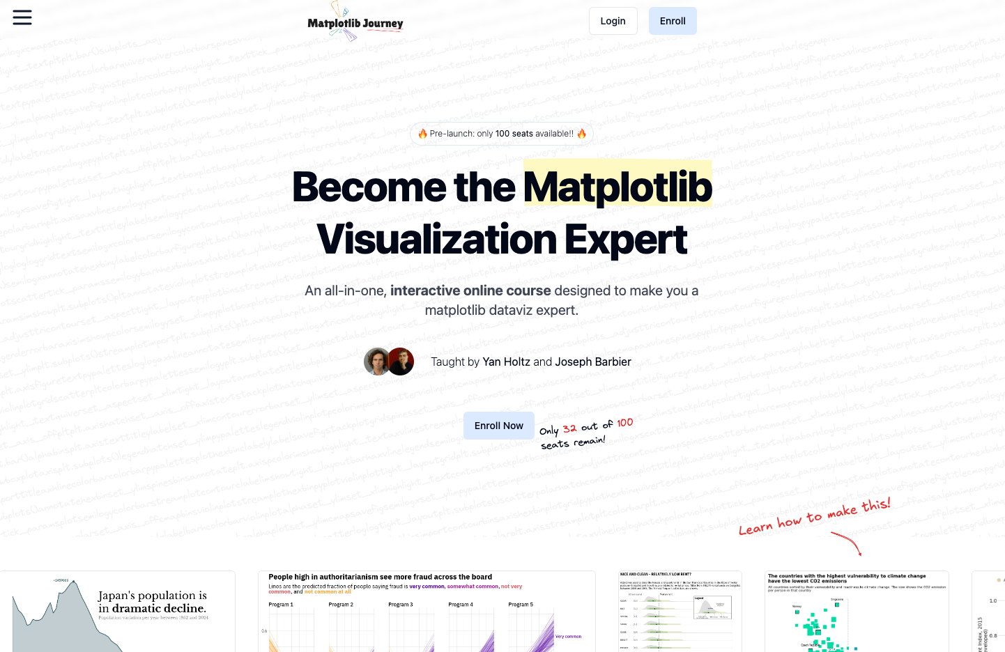
If you like those examples, you will love Matplotlib Journey. It's an interactive online course crafted to transform you into a Matplotlib dataviz expert. It provides a clear, big-picture understanding of how data visualization works in Python, empowering you to grasp any example from the gallery with ease.
Finally, Understand Matplotlib.🚨 Grab the Data To Viz poster!
Do you know all the chart types? Do you know which one you should pick? I made a decision tree that answers those questions. You can download it for free!
